Info
Nilus is a B2B online marketplace
An online new Retail & marketplace platform.
connecting convenience stores, grocery shops and kiosks – directly to a variety of suppliers using cutting edge technology. Redefining the Retail ecosystem in Israel, using innovative Data-Driven Technology, shared economy, intuitive design of our marketplace, efficient supply chain and a skillful customer service.

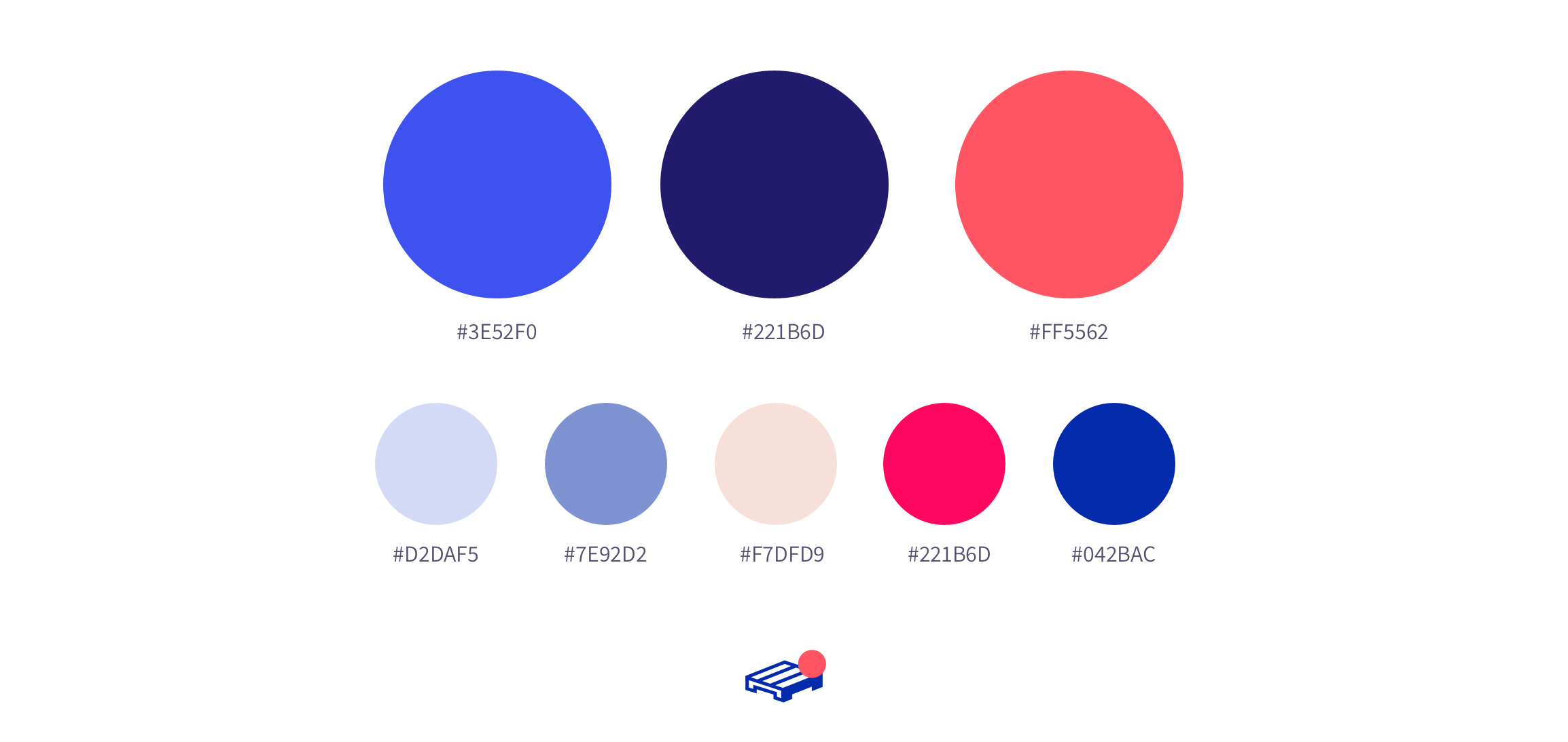
Brand colors & Marketing assets
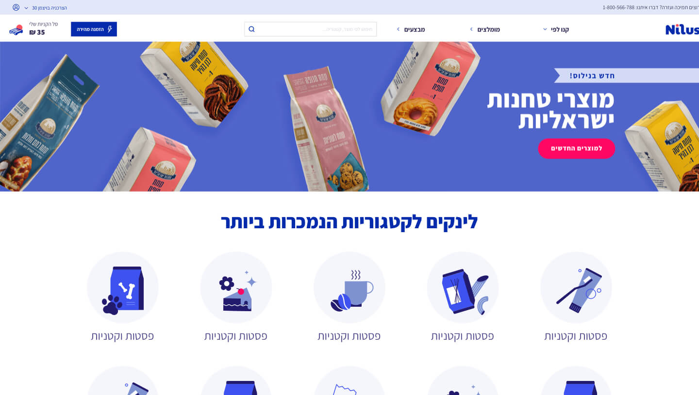
The pallet was chosen to replace the cart icon – to symbolize the B2B theme – a large scale pallets & boxes – in opposed to the individual personal shopping cart.
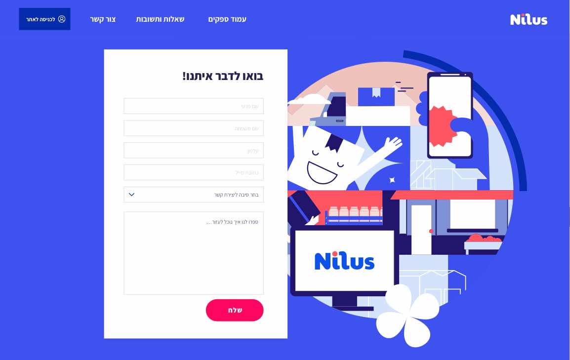
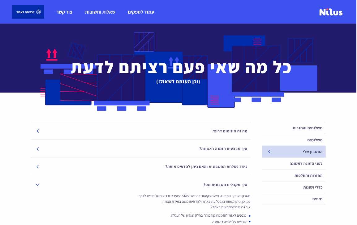
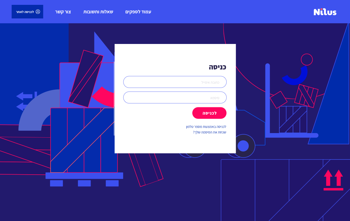
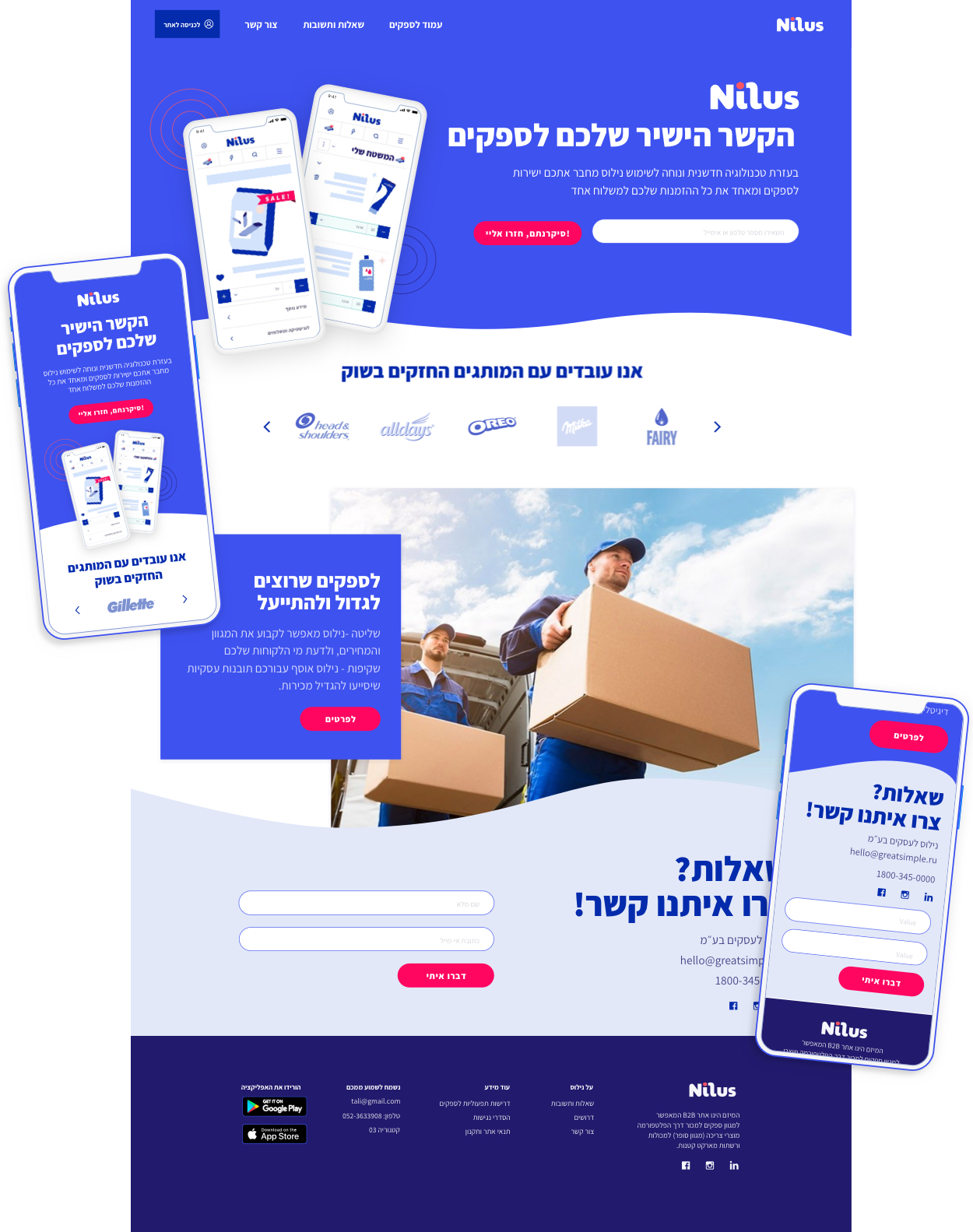
The Pallets & large cardboard boxes theme are also used as illustrations for costumer-facing marketing assets: Sign in pages, 404, contact us etc.
First, the Product
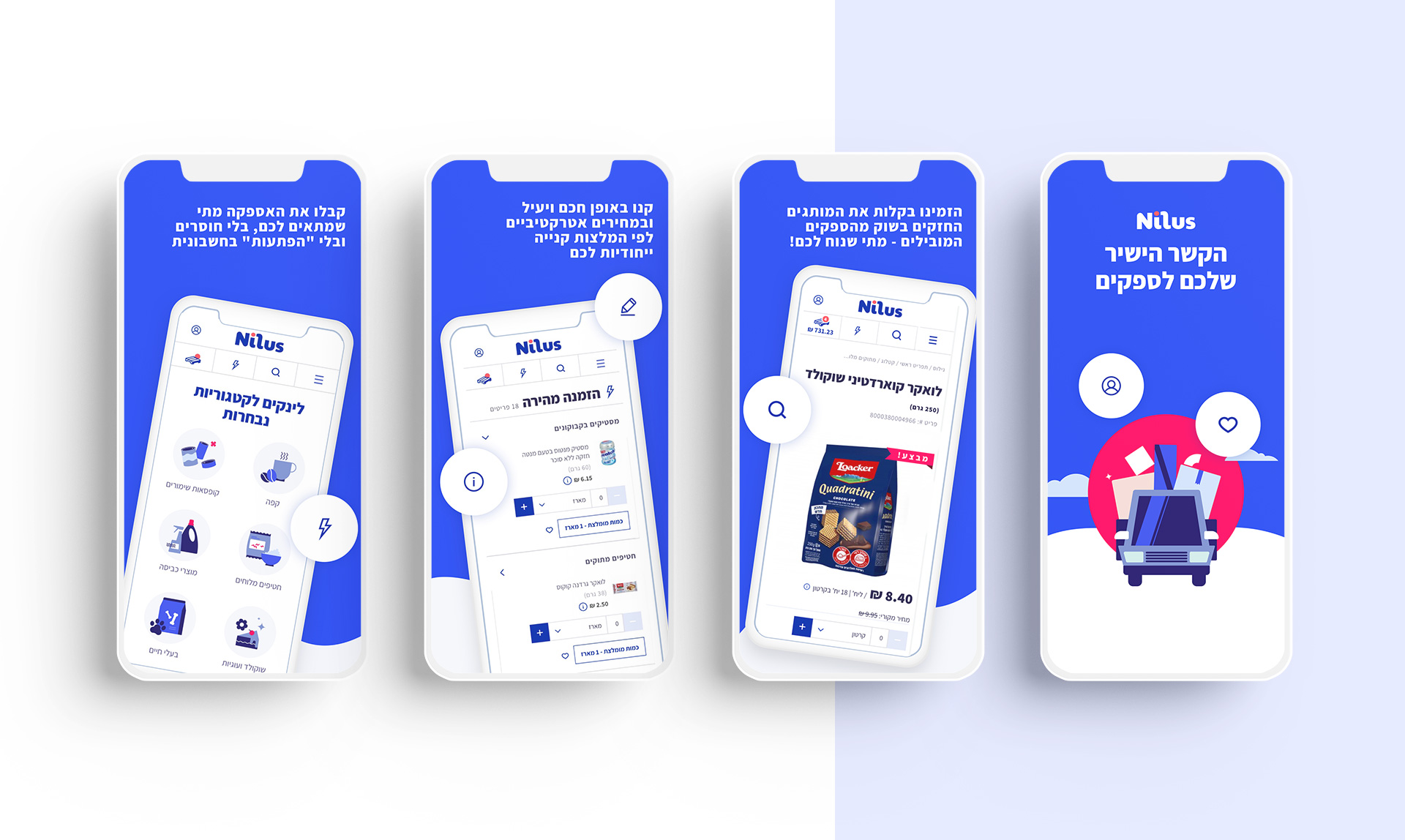
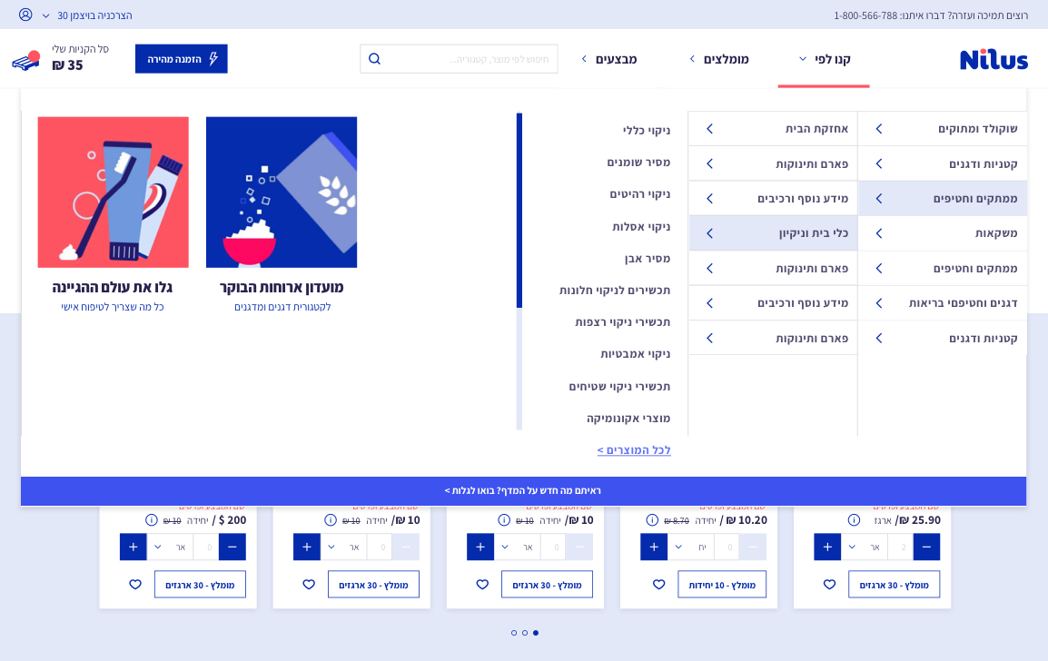
a B2B platform requires a unique experience – unlike a “regular” e-commerce website. with a quick order page with build-in amount recommendations, adding and subtracting buttons for minimum clicks, an algorithm for similar stores product recommendations.
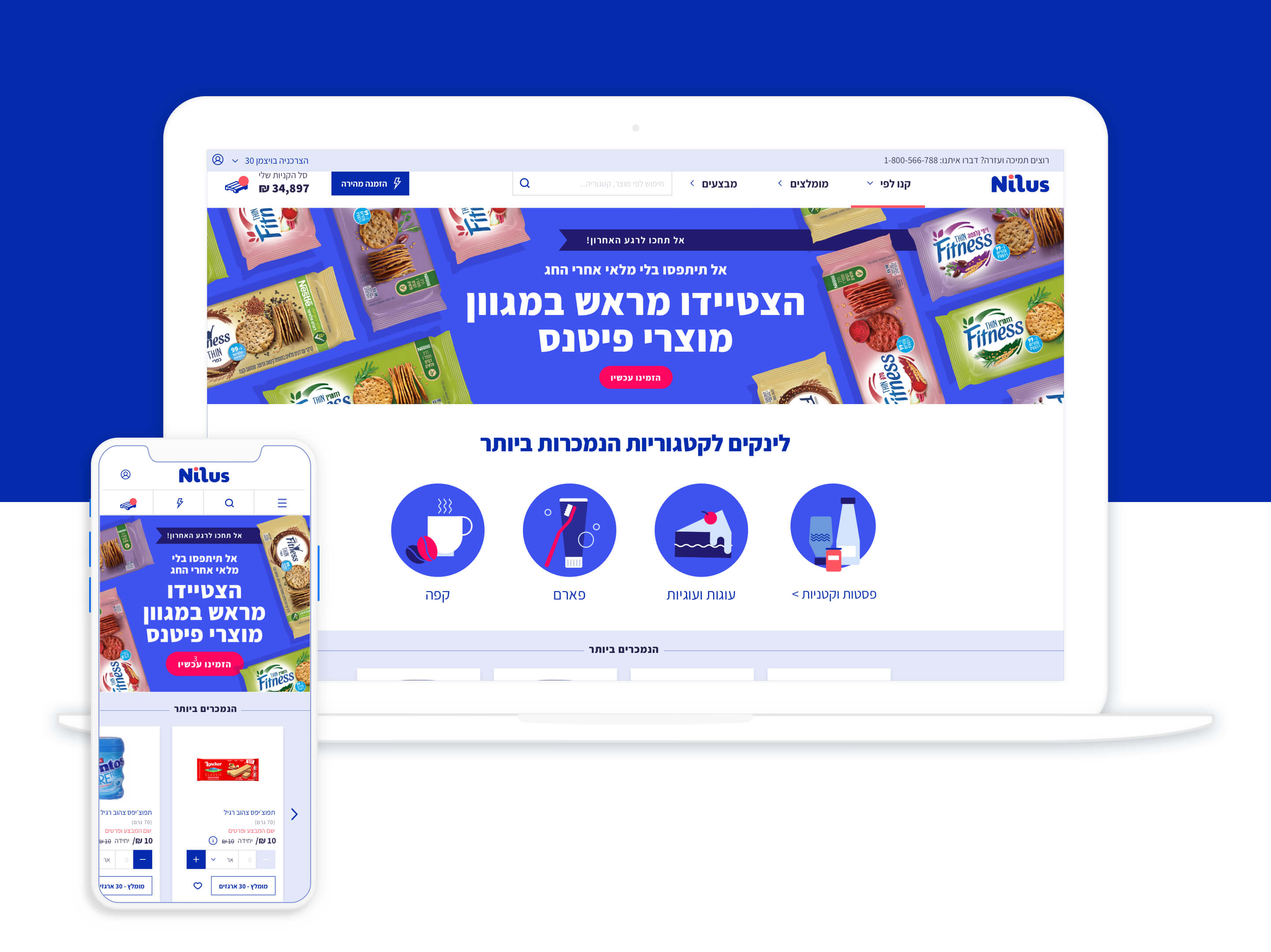
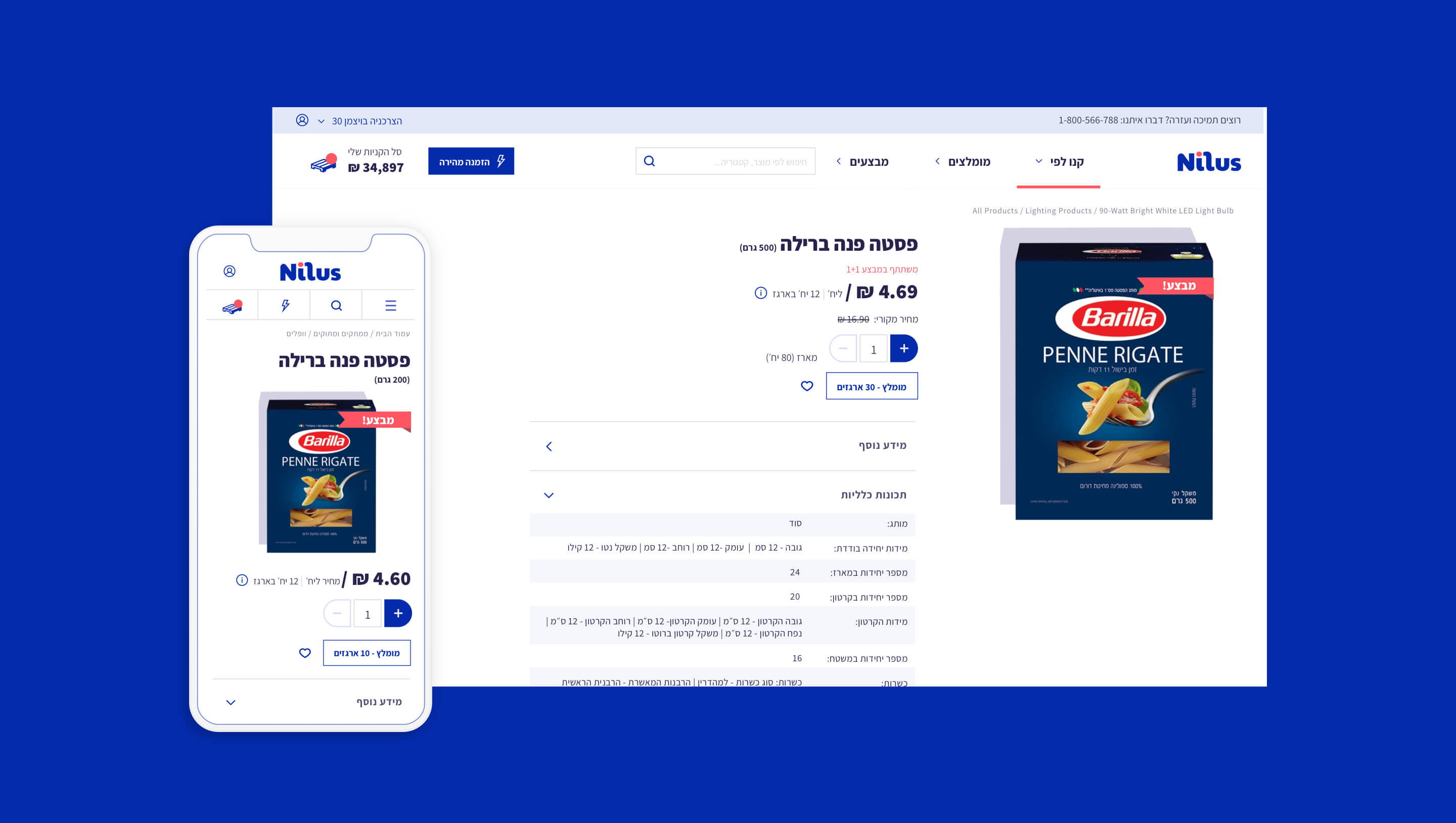
A look into website Screens
Marketing & visual language
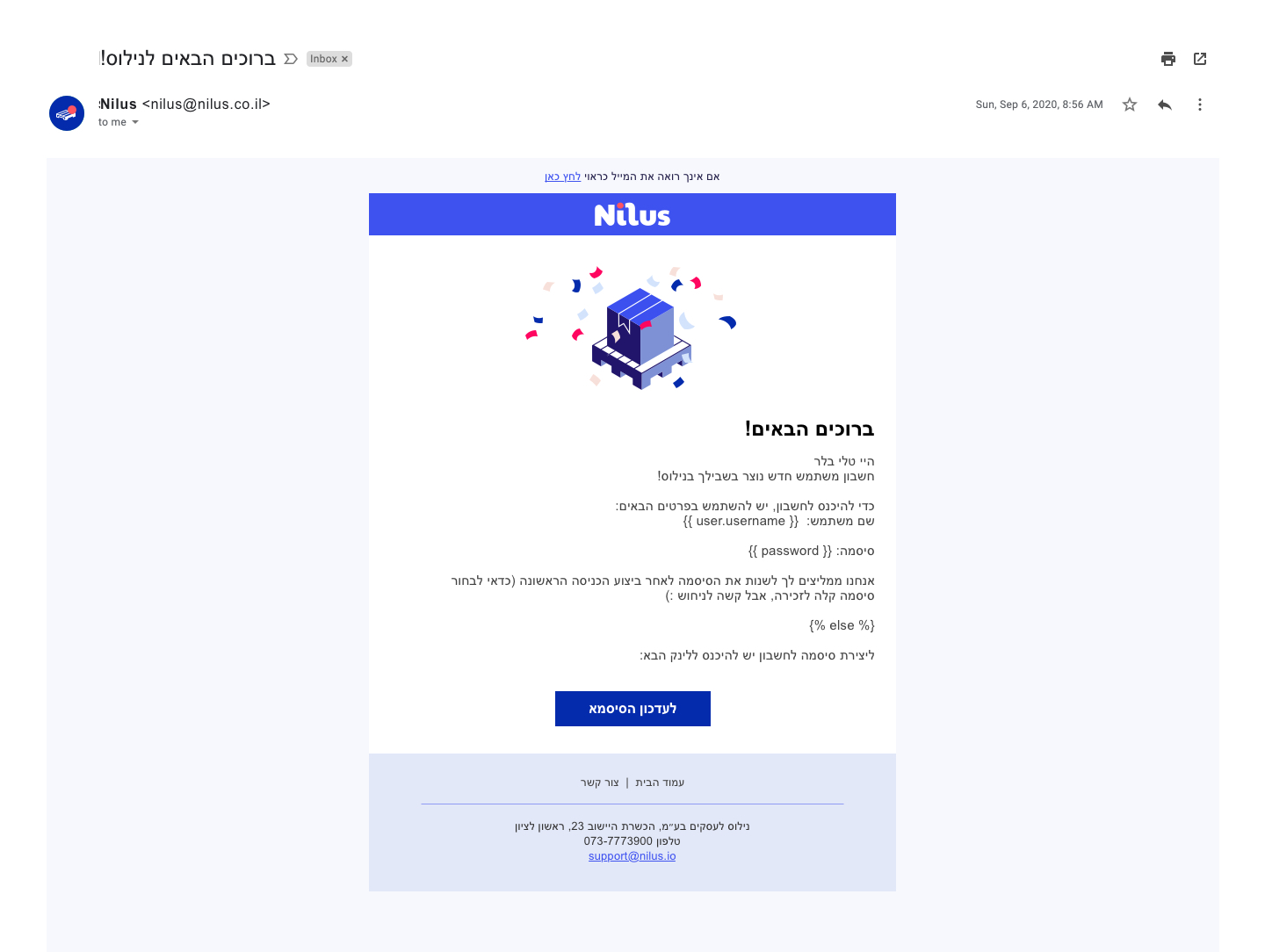
Creating all marketing assets from scratch, being a B2B supermarket facing small retailers – we did not want to use images of general produce or big warehouses. We used an illustrator to create a flat & bold-colored identity for the guest homepages, emapty states and all costumer facing pages as contact us, newsletters and blog.
App Store Screens
